
Internal Design system Documenation
Role
UX Researcher (Contract)
Methods
Rapid Iterative Testing & Evaluation
Heuristic Evaluation
Contextual Inquiry
Cart Sort
Information Architecture Testing
Content Analysis
Usability Test
Tools

TEAM
3 Product Managers
5 Designers
1 Engineer
Ownership
Kick-off & Alignment
Recruitment
Protocol & Script Creation
Execution & Moderation
Data Analysis & Synthesis
Presentation & Shareout
Overview
The Challenge
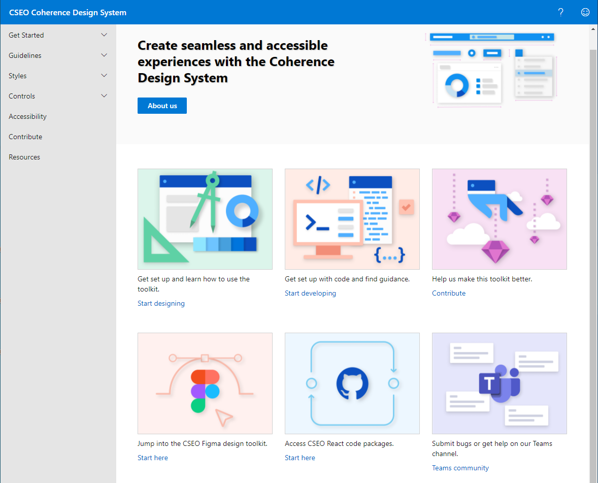
Coherence is an internal design system, which is used to build employee tools. The Core Services Engineering and Operations (CSEO) team where I sit was tasked with building a documentation platform to house Coherence component descriptions, component code, best practices, and help/support.
Prior to the documentation platform, the documentation would be scattered across Sharepoint and users would rely on Teams to get questions answered, so we asked How might we optimize and streamline the use of the Coherence design system?
The Process
To create a continuous feedback loop that would provide the designers and engineers quick design direction, my team employed the Rapid Iterative Testing and Evaluation (RITE) method.
I was in charge of gathering the research questions, building the study plan, running the sessions, synthesizing, and reporting on a biweekly basis.
The Solution
In 6 weeks, my team took the platform from V0 to V1. Another 6 weeks of iteration gave us the research data that would provide a concrete information architecture, efficient task flows, and supportive features.
4.7
Average Satisfaction Rating
8
Studies
32
Participants
/5
Building the RITE Workflow
My team and I built out the program based on a timeline of delivering a fully-developed platform at the end of Q1 2021. I conducted and delivered an end-to-end study every other week, followed by a week of presenting and planning for the next round.
The team already had an early-stage MVP (V0) so the research initiative started with generative studies - a heuristic evaluation and a few weeks focused on contextual inquiries tailored to different disciplines.
I then moved into evaluative research, building out the information architecture using open and hybrid card sorts and a combination of tree testing and A/B testing.
Heuristic Evaluation:
UI Tenets & Traps
To ramp up the RITE program, I took V0 of the documentation platform through a Heuristic Evaluation. I used the UI Tenets & Traps system that was widely-accepted across the organization (several employees were involved in building and evangelizing this system).
Right away, we were able to find quick fixes, highlighting actions and removing distractions, that would clean up V0 prior to the contextual inquiries.
Contextual Inquiries:
Focus on Different Disciplines
Since this platform was going to be used by designers, engineers, product managers, and data scientists, I created tailored Contextual Inquiry test guides to investigate each user type.
For the engineers, I gathered some contextual evidence by analyzing the questions posted in their support channel on Teams. I validated these queries by observing how they might use the documentation platform to answer these questions.
For designers, I observed how they used the platform in conjunction with the Figma toolkit and how they navigated to the components they needed.
The product managers and data scientists used the platform to understand what a component was and how it should be implemented; this helped them communicate product requirements to their team.
Information Architecture:
Card Sorting + Tree Testing + A/B Testing
This platform was being built from the ground up so one of the most important research objective was understanding users’ mental models and building the information architecture accordingly.
I started with an open card sort and then aggregated the results and validated the aggregate through a hybrid card sort. This gave us an early version of the navigation and identified ambiguous navigation items.
I further tested the navigation by creating two versions, each with the ambiguous items in different places, to use in an A/B tree test. Half of the participants completed tasks using version A and the other half used version B. The navigation was built with the most successful “tree.”
Content Analysis: Comprehension
This platform was made to house documentation primarily so the correct and concise content was essential. Through a content-focused cognitive walkthrough, I identified areas of confusion and dead ends. I worked closely with the Content Designer to ensure clear descriptions and relevant elements. A second round of content analysis showed improved comprehension and satisfaction.
Wrapping Up with Usability
Finally, I gathered a few participants from the various disciplines to complete the major tasks one more time in a Usability Test. Their behaviors matched the ideal tasks flows we outlined.
In the same session, I surveyed them to understand their attitudes towards the platform and their average ratings for satisfaction, likeliness to use, confusion/frustration (inverse), and the look and feel all rated “Reliably Above Criteria” as expected.
“My team and I use the design system every day so we’re always looking for the code and troubleshooting around a problematic component. This one-stop shop would help a lot.”
~ Design User
Final Thoughts
I was only with this client for a short while, but the exposure to the type of research conducted within an organization of such wide reach and influence confirmed to me that research never ends! As part of the CSEO Studio team and the Foundational Research team, I got to collaborate with colleagues that really thought about their work as their impact on the world, which is something that inspired me greatly as I find my footing in my career. With such a supportive and growth-minded atmosphere, I too started to believe in the value of my work. Although I find myself looking outwards for newer opportunities and challenges, I’m deeply grateful for the people and experiences with this team.
Other Microsoft Projects
Improving workflows on employee platform MyHub
With about 163,000 employees, transforming even slight interactions within the client’s internal products takes diligent effort. Any change would generally impact the day-to-day of an employee because these tools were often integral to their jobs. I focused on workflows like onboarding, learning best practices, and seeking guidance. I provided insight to the internal stakeholders on things like the context of use, the usability and learnability of all of the task flows, and the various interactions on internal platforms. Below are snippets of these reports.
Research Background
Detailed Finding: Help Panel Layout
Detailed Finding: Manager Hub Actions
Detailed Finding: Onboarding Tool Tips
Post-Study Metrics
Research Summary